


Subscribe to receive a weekly roundup direct to your inbox.
Helvetica was the typeface for Apple until 2015 and the exhibition ’50 Years of Helvetica’ spent nearly a year on display at the MoMA.
It feels like fonts have just always been there right? Their history is more interesting than you would imagine though, especially before the transition to the digital age.
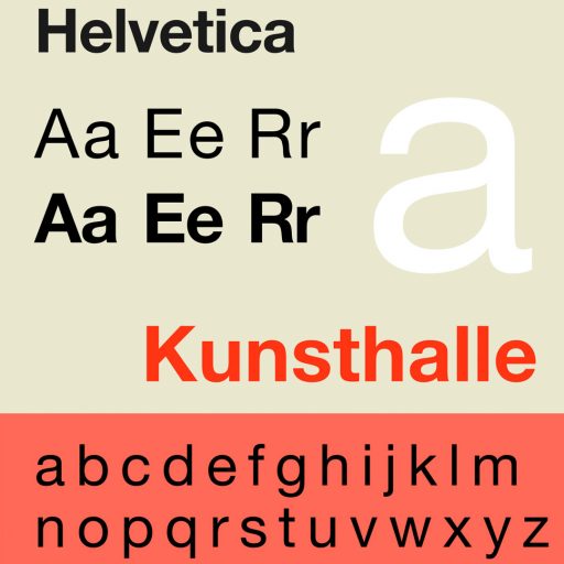
Helvetica, a sans-serif typeface, was developed by Max Miedinger in 1957. Sans-serif typeface doesn’t have the extending ‘serif’ features that we see at the end of strokes in many other fonts. Helvetica is a minimalist font used mostly for headings or statements as opposed to body text. Notable features include a high x-height, small line spacing and termination of strokes on horizontal or vertical lines, so no ‘wavy’ strokes.
The overarching goal of the typeface was to be neutral and clear with no meaning or message worked into the form. Linotype licensed the typeface and renamed it Helvetica, similar to the Latin word for Switzerland, Helvetia. This also made it more marketable internationally with the resemblance to German not being popular at the time.
Akzidenz-Grotesk, a typeface from the turn of the 19th century, was influential in the design process of the Helvetica font. The font’s popularity soared after the war when Swiss designers adopted it as the go-to font for their design work. Typefaces were still being imported for Linotype machines during this time so a company wouldn’t naturally own a large library of typefaces like we see today.
In the 1970s Helvetica was licensed to Xerox, Adobe and Apple cementing it in the typeface Hall of Fame. It remained popular during this transition to digital and has also been created for Latin, Hebrew, Japanese, Korean, Hindi and even similar Chinese faces.
Some artists and designers pushed back against Helvetica for being the typeface of the MAN and intentionally avoided it. Leslie Savan went as far as writing an essay about the Helvetica monopoly on typeface.
In the US your income tax forms are in Helvetica – so maybe causes trauma for some Americans.

